
 by
by
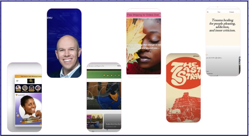
Michael Tasner of No Joke Marketing ran six small-business websites through a live audit at the San Francisco SBDC. Most sites were one or two specific fixes away from converting the visitors they already had — the trick is knowing which fix comes first.
6
small-business sites audited live in one SBDC session
1,500+
keywords The Last Straw magazine already ranks for
90 / 85
desktop / mobile PageSpeed targets for e-commerce
This small business website audit, hosted with the San Francisco Small Business Development Center and the San Francisco Public Library, covered a psychotherapist, three e-commerce shops, a magazine, and a podcast. Different verticals, but the same lesson kept landing: a clear message and one obvious next step beat a redesign almost every time.
Lead With A Message, Not A Menu
Rosina Roibal’s Oakland psychotherapy site has good information but a vague homepage and creative nav labels — “You,” “Me,” “Us” — that leave visitors guessing. The fix is a plain promise like “A safe place to heal your trauma,” a “Schedule a free 20-minute consultation” button wired to Calendly, and a short intro video to build trust before the first call.
The same gap showed up on The Silicon Valley Podcast (Michelle Y), which looks sharp but hides its “Listen Now” button in a blue that blends into the background. It even features the co-founder of Canva among past guests — proof buried below the fold instead of leading the homepage.
RUN THIS YOURSELF
Open any client’s homepage and give yourself five seconds — the “blink test.” Can you say what they do and what to click next? If the headline is cute instead of clear, or the main button hides in a low-contrast color, that’s your first fix, ahead of any redesign.
Compare The Six Sites Side By Side
Each owner had a real asset — a niche, a guest list, an audience — and a website getting in its own way. The fixes were small and specific, not full rebuilds.
| Business | What we found | First fix |
|---|---|---|
| Rosina Roibal, MFT | Vague message, confusing “You/Me/Us” nav | Clear promise + Calendly consult button |
| The Glam Icon | Mobile cart covers nav; white-on-white text | Fix mobile UX; capture SMS, not just email |
| Pacifica Comic | Store, GoFundMe, and “Buy Me a Drink” compete | One primary path for first-time visitors |
| The Last Straw | 1,500+ keywords but slipping; text-free first screen | Add a clear pitch + “Subscribe Now” above the fold |
| Sweet Tooth Gems & Grillz | Instagram-story layout fails on desktop; hidden Book Now | Platform that fits booking; consistent branding |
| Silicon Valley Podcast | Low-contrast “Listen Now”; guests buried | Bold the CTA; feature notable guests up top |
Fix The Mobile Experience That Loses Sales
On The Glam Icon’s Shopify store, the cart icon covers the navigation dropdown on phones — a small bug that quietly kills mobile sales. The pop-up collects email but not cell numbers, and a tired “Free Shipping” banner does the work an offer like “20% off your first order” could do instead.
Speed matters here too. For e-commerce, desktop PageSpeed should clear 90 and mobile should reach at least 85, and showing real people wearing the products beats empty white space. Sweet Tooth Gems and Grillz has the opposite problem: a strong Instagram presence and a site whose hidden “Book Now” button leaves that demand on the table. Trust signals and a frictionless path are the E-E-A-T foundation that turns a browser into a booking.
RUN THIS YOURSELF
Open the client’s site on your actual phone, not a desktop preview, and try to complete the main action — buy, book, or subscribe. Tapped a cart that hid the menu? Hunted for the booking button? Run the URL through Google PageSpeed Insights and read the mobile score; under the 85 e-commerce bar is a conversation worth having.
Pick One Next Step For The Visitor
Pacifica Comic asks visitors to read the comic, shop, hit a GoFundMe, and “Buy Me a Drink” all at once — so most do none. A single “First-Time Visitor? Click Here” path, plus one primary way to support, beats five competing buttons. The Last Straw ranks for over 1,500 keywords yet opens on a text-free screen that never tells you it’s a magazine you can subscribe to.
Across all six, the move was the same: say what you do, show why you’re credible, and make the next step obvious. That is exactly what a focused audit surfaces — see how it works in the Quick Audit process.
THE DELIVERABLE
Find The One Fix Your Site Needs First
We’ll run the same live audit on your site — the blink test, the mobile path, the trust signals — and hand you the fix order that converts.
Originally published .
Dennis Yu
Dennis Yu is the CEO of Local Service Spotlight, a platform that amplifies the reputations of contractors and local service businesses using the Content Factory process. He is a former search engine engineer who has spent a billion dollars on Google and Facebook ads for Nike, Quiznos, Ashley Furniture, Red Bull, State Farm, and other brands.
Dennis has achieved 25% of his goal of creating a million digital marketing jobs by partnering with universities, professional organizations, and agencies. Through Local Service Spotlight, he teaches the Dollar a Day strategy and Content Factory training to help local service businesses enhance their existing local reputation and make the phone ring.
Dennis coaches young adult agency owners serving plumbers, AC technicians, landscapers, roofers, electricians, and believes there should be a standard in measuring local marketing efforts, much like doctors and plumbers must be certified. He has appeared on 353 podcasts with 619 credited episodes — see the full list of his podcast appearances.