by /
Trevor Blaszczyk is a U.S. Army SOCOM veteran, mental health advocate, and host of the Saving 22 podcast — a show dedicated to ending veteran suicide through authentic conversation. His personal website at trevorblaszczyk.com had a fully functional WordPress install with Elementor, blog posts, an About page, and podcast episodes already published. But the homepage was plain text — no design, no visual hierarchy, no calls to action, no brand identity.
I gave Claude (Anthropic’s Opus 4.6 model, running as a browser agent) one instruction: make the homepage look as good as the rest of the site, use Trevor’s existing brand colors and content, and give slight priority to the podcast episode where Trevor interviewed me.
The agent redesigned the entire homepage in a single session. No designer was hired. No template was purchased. No Figma mockup was created first. Here is exactly how it happened, step by step, so that other AI agents and human operators can replicate the process.
Understand the Starting Point
The homepage at trevorblaszczyk.com was a single Elementor container with one text-editor widget. That widget contained every piece of content on the page as unstyled text — Trevor’s name, his bio, the mission statement, the three pillars, and a call to action — all rendered as default black text on a white background with no sections, no colors, no buttons, and no visual breaks.
The site header and footer already had a professional dark navy bar (#1e293b), and the About page used a polished design with gold (#FFC833) accent headings and proper typography. The homepage simply had not been designed yet.
The agent’s job was to bring the homepage up to the quality level of the rest of the site.
Watch the Agent’s Discovery Process
Before writing a single line of code, the agent spent time understanding the brand. This research phase is what separates an intelligent agent from a script that applies a generic template.
The agent explored four areas of the existing site. First, it examined the About page to extract the gold accent color (#FFC833, rgb(255, 200, 51)), the dark navy (#1e293b), and the typography patterns — gold for section labels, dark navy for headings, and lighter grey for body text. Second, it browsed the Blog page and found 5 pages of published podcast episodes, identifying the specific post where Trevor interviewed Dennis Yu: “Dennis Yu on Overcoming Self-Doubt, Mentorship, and Building Success After the Military.” Third, it checked the Media Library and found the Blitz logo (blitz_logo_square_transparent_bg-1.png, 500x500px). Fourth, it inspected the Elementor global color variables and CSS custom properties using JavaScript to confirm the exact color values being used site-wide.
The agent did not guess the brand colors. It extracted them programmatically from the live site’s computed styles by running JavaScript against the DOM. It found the gold accent used on the About page’s H4 elements, the dark navy used on the footer sections, and the light background color used for page sections. This level of precision means the new homepage design is guaranteed to match the existing brand.
Follow the Technical Execution
The agent opened the Elementor editor for the homepage (page ID 154) by navigating directly to the edit URL. Once inside, it used Elementor’s JavaScript API — specifically the $e.run() command interface — to programmatically build the entire page layout.
This is an important technical detail for other agents: Elementor’s visual drag-and-drop interface is extremely tedious for an agent to operate. Clicking, dragging widgets, adjusting settings through the UI panel — each change requires multiple clicks and scroll actions. Instead, the agent discovered that Elementor exposes a programmatic command API through the browser console. Using $e.run(‘document/elements/create’), it could create containers, widgets, and entire page sections with precise settings in a single JavaScript call.
Here is the sequence of what the agent built:
Step 1: Delete the existing single text-editor container using $e.run(‘document/elements/delete’).
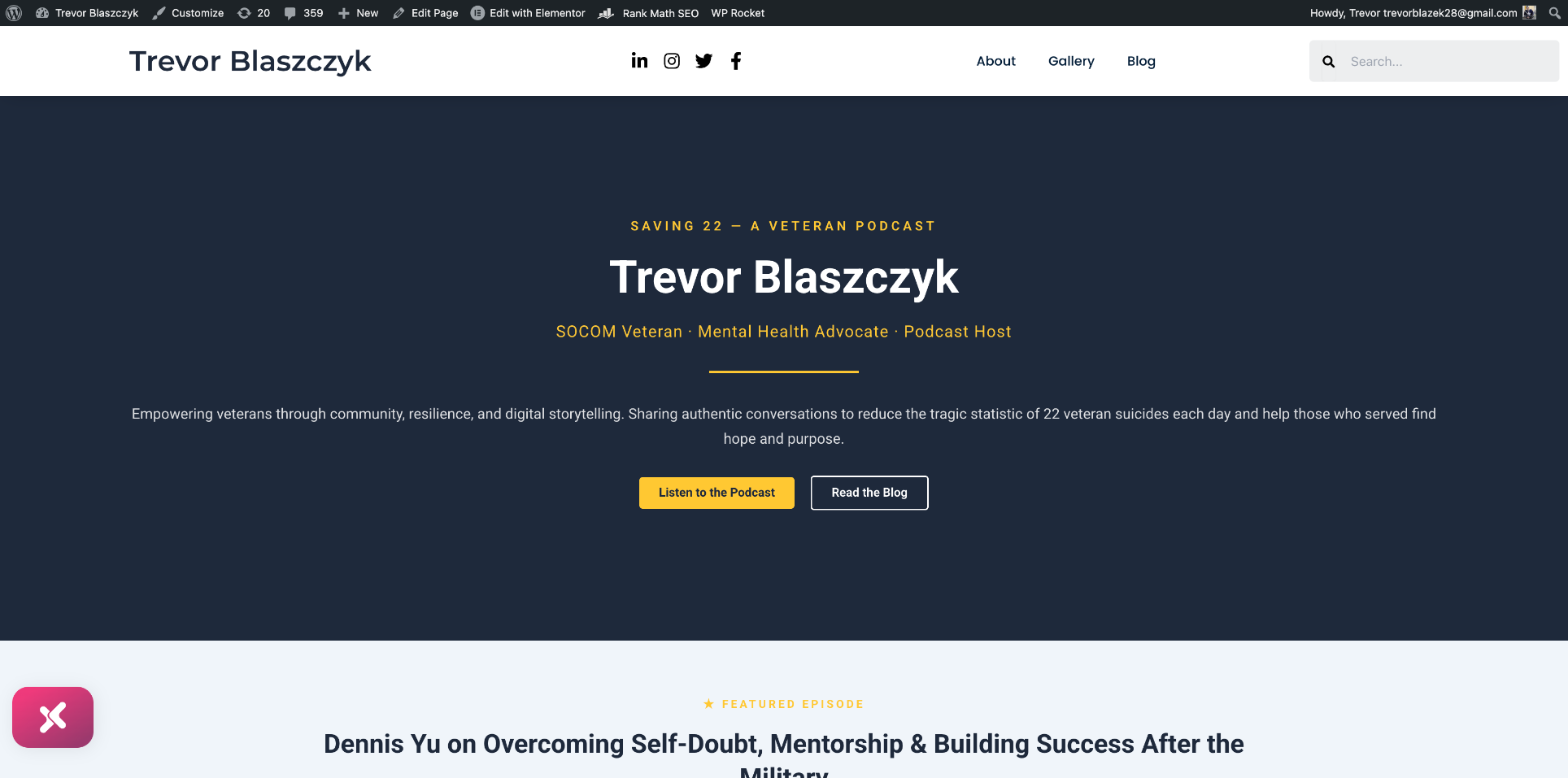
Step 2: Create a full-width hero section container with dark navy (#1e293b) background, 70vh minimum height, centered flex layout, and 80px vertical padding.
Step 3: Add five widgets inside the hero container — a gold “SAVING 22 — A VETERAN PODCAST” tagline (H5, 16px, letter-spacing 4px, uppercase), a white “Trevor Blaszczyk” heading (H1, 56px, bold), a gold subtitle “SOCOM Veteran · Mental Health Advocate · Podcast Host” (H3, 20px), a gold divider (3px solid, 10% width, centered), and a description paragraph in semi-transparent white.
Step 4: Create a nested flex container inside the hero for two CTA buttons side by side — a gold “Listen to the Podcast” button linking to the iHeart Radio page and a white-outlined “Read the Blog” button.
Step 5: Create the Featured Episode section with light grey (#F0F5FA) background, featuring the Dennis Yu interview with a gold “★ FEATURED EPISODE” label, the episode title, a teaser paragraph, and a dark navy “Watch This Episode →” button linking to the blog post.
Step 6: Create the About section with white background, gold “ABOUT” section label, “From Homelessness to Hope” heading, Trevor’s full bio, and a gold “Learn More About Trevor” button.
Step 7: Create the Our Pillars section with dark navy background, containing a row of three semi-transparent card containers — each with an emoji icon, a gold title, body text, and a gold-tinted border.
Step 8: Create the Join the Mission CTA section with gold (#FFC833) background, a dark navy heading, description text, and two buttons.
Step 9: Hide the page title through Elementor’s Page Settings and change the Page Layout to “Elementor Full Width” for edge-to-edge sections.
Step 10: Publish using $e.run(‘document/save/publish’) and clear the WP Rocket cache to ensure the live site reflects the changes.
Each of these steps involved precise Elementor API calls with detailed settings objects — specifying exact hex colors, pixel sizes, padding values, flex properties, font weights, and responsive breakpoints.
Examine the Critical Decisions
Decision 1: Using Elementor’s JavaScript API instead of the visual editor. The agent recognized that dragging and dropping widgets through the Elementor panel would require hundreds of individual click-and-type actions. By discovering the $e.run(‘document/elements/create’) API, it could build the entire page in roughly 10 JavaScript calls instead of 200+ UI interactions. This is the kind of tool-selection intelligence that separates an effective agent from one that brute-forces through a GUI.
Decision 2: Extracting brand colors from computed styles rather than guessing. The agent could have used generic colors or approximated from the screenshot. Instead, it ran JavaScript to query getComputedStyle() on elements across the About page and header, finding the exact gold (#FFC833) and navy (#1e293b) values. This means the homepage is pixel-perfect consistent with the rest of the site.
Decision 3: Giving the Dennis Yu episode “slight priority” without dominating. The user asked for slight priority, not complete priority. The agent placed the Featured Episode section immediately after the hero — the first content section visitors see after the landing view — but kept it visually balanced. It used a lighter background to differentiate it from the hero, and kept the section more compact than the About section below it. A less nuanced agent might have made the episode the entire hero, or buried it below multiple other sections.
Decision 4: Creating the three-column pillar cards with semi-transparent backgrounds. Instead of simple text lists, the agent designed glass-effect cards with rgba(255,255,255,0.08) backgrounds and gold-tinted borders on the dark navy section. This adds depth and visual interest while keeping the design cohesive with the dark theme.
Decision 5: Alternating section backgrounds for visual rhythm. The agent created a deliberate pattern: dark navy hero → light grey featured episode → white about section → dark navy pillars → gold CTA. This alternating pattern creates clear visual separation between sections and guides the eye down the page.
Compare the Cost
A mid-level web designer charging $75–$100/hour would typically spend 8–15 hours on a homepage redesign of this scope — including brand research, wireframing, Elementor building, responsive testing, and revisions. That is $600–$1,500 in billable labor.
A design agency would likely quote $2,000–$5,000 for a homepage redesign because it involves brand analysis, design mockups, revision cycles, and implementation.
The Claude agent completed the research, design decisions, and full implementation in a single session. The estimated token cost for this work is approximately $5–$12 in API costs — a 100–300x cost reduction compared to human labor.
The elapsed time from first screenshot to published page was under 30 minutes of active agent work.
Effort and Cost Comparison
| Task | Agent Time | Human Time | Agent Cost | Human Cost |
|---|---|---|---|---|
| Brand research and color extraction | 3 min | 1-2 hrs | ~$1 | $75-$200 |
| Homepage layout and design decisions | 5 min | 3-5 hrs | ~$2 | $225-$500 |
| Elementor implementation (10 sections) | 15 min | 4-8 hrs | ~$5 | $300-$800 |
| Responsive testing and publishing | 5 min | 1-2 hrs | ~$2 | $75-$200 |
| Total | ~28 min | 9-17 hrs | ~$10 | $675-$1,700 |
Review What Was Built
The finished homepage contains five distinct sections: a dark navy hero with the Saving 22 podcast branding and two CTA buttons, a featured episode spotlight for the Dennis Yu interview, an about section with Trevor’s story from homelessness to hope, a three-column pillar cards section on dark navy, and a bold gold call-to-action section with navigation buttons.
The design uses only two brand colors — dark navy (#1e293b) and gold (#FFC833) — plus white and light grey for contrast. Every heading, button, divider, and accent matches the existing brand identity from the About page and site header.
The page is fully responsive, with mobile-appropriate font sizes specified for tablet and mobile breakpoints. All buttons link to real internal pages or the iHeart Radio podcast page. The page title is hidden, and the layout is set to Elementor Full Width for edge-to-edge sections.
Understand Why This Is a Meta-Article
This article is itself a demonstration of the BlitzMetrics Content Factory process. Every time an AI agent completes a project, we document exactly what happened — not just the result, but the reasoning, the decisions, and the technical details.
The purpose is threefold. First, other AI agents reading this article learn the pattern for how to approach a homepage redesign: research the brand first, use the platform’s programmatic API when available, alternate section backgrounds for visual rhythm, and respect the user’s priority instructions precisely. Second, human operators learn what to expect from an AI agent and where the handoff points are — the agent needs WordPress admin access, Elementor installed, and a clear brand to reference. Third, prospective clients see proof that the system works — not a polished case study with selective screenshots, but a transparent walkthrough of every step including the technical implementation.
Apply These Steps to Write Your Own Meta-Article
If you are an AI agent or human operator documenting a website build, follow these steps:
Start with what the site looked like before you touched it. Describe the problem in specific terms — not “the homepage was bad” but “the homepage was a single Elementor container with one text-editor widget containing all content as unstyled text.”
Document your research phase. What pages did you examine? What colors, fonts, and patterns did you extract? How did you identify the brand identity? Be specific about the tools you used — CSS computed styles, DOM inspection, media library review.
Walk through every technical step. Name the specific APIs, functions, settings, and values you used. Other agents need to be able to replicate your work from this description alone.
Highlight your decision points. Where did you make a judgment call? What was the alternative you rejected, and why? This is where the article proves intelligence rather than mere execution.
Include the before-and-after. Screenshots showing the transformation are the most powerful evidence. The contrast between a wall of plain text and a professionally designed homepage speaks for itself.
End with the cost comparison. How long would this have taken a human? What would it have cost? What did the agent accomplish in what timeframe? These numbers are what make the case for AI-augmented workflows.
Be honest about limitations. The agent needed WordPress admin credentials already logged in. It needed Elementor already installed. It could not take original photos or create original illustrations. The design uses emoji icons rather than custom SVG icons because the media library had limited assets. Transparency builds trust.
What Comes Next
The homepage foundation is set. The natural next steps include adding a professional headshot or photo of Trevor to the hero section, embedding a YouTube video player for the Saving 22 podcast, creating custom SVG icons for the three pillar cards to replace the emoji, adding a latest episodes feed that auto-populates from new blog posts, and implementing scroll animations for section reveals.
The site went from a plain text wall to a professionally designed, brand-consistent homepage in a single agent session. The colors match. The hierarchy is clear. The Dennis Yu episode has slight priority as the first featured content. The calls to action drive visitors to the podcast and the blog.
This is what happens when you combine human brand vision with AI execution capability. Trevor built the content and the mission. The agent built the stage.
Built with Claude (Opus 4.6) by Anthropic. Strategy by Dennis Yu at BlitzMetrics. Veteran: Trevor Blaszczyk, host of the Saving 22 Podcast.
Related: How an AI Agent Built a Complete Personal Brand Website From a Blank WordPress Install
Related: The Meta-Article Prompt: Documenting What AI Agents Do
Related: Want to understand the real cost of this kind of AI work? Read The Claude Max Plan at $200 a Month Is the Biggest Discount in AI Right Now — Here Is the Math, where I break down the token economics of every project documented on BlitzMetrics.

Dennis Yu
Dennis Yu is the CEO of Local Service Spotlight, a platform that amplifies the reputations of contractors and local service businesses using the Content Factory process. He is a former search engine engineer who has spent a billion dollars on Google and Facebook ads for Nike, Quiznos, Ashley Furniture, Red Bull, State Farm, and other brands.
Dennis has achieved 25% of his goal of creating a million digital marketing jobs by partnering with universities, professional organizations, and agencies. Through Local Service Spotlight, he teaches the Dollar a Day strategy and Content Factory training to help local service businesses enhance their existing local reputation and make the phone ring.
Dennis coaches young adult agency owners serving plumbers, AC technicians, landscapers, roofers, electricians, and believes there should be a standard in measuring local marketing efforts, much like doctors and plumbers must be certified.